
Plainly prescription opioid abuse is flat then declining over this period. (The SAMHSA survey refers to opioids with the dull term "pain relievers".) And, looking at the CDC data, it's clear that drug poisoning deaths are increasing over this period. But it makes little sense to restrict ourselves to this time frame. Attitudes about opioids and prescription practices supposedly started changing in the early 1980s, with doctors becoming more relaxed and more willing to prescribe. A very short letter published in the New England Journal of Medicine in 1980 supposedly kicked off the change in attitudes toward opioids. By starting in 2002 we would miss two decades of the relevant trend-line. There is another survey that tracks opioid use, Monitoring the Future, that goes back to the mid-1970s. But it only tracks 12th graders, who won't necessarily be representative of the older patients, people with chronic pain, limited mobility, and various infirmities, who are most likely to be affected by loose prescribing practices. Here it is, anyway:

Plausibly, this tells a story of opioid abuse rising in the 90s, from ~3% to ~9%. But then, in the 2000 to 2010 period, when opioid prescriptions tripled, the abuse rates are roughly flat, even declining. And abuse rates are trending down in the 1980s. One has to cherry pick carefully to make it look like prescription practices are correlated with opioid abuse rates. Also problematic: "Past 12 month use" patterns might be very different from, say, addiction rates or more frequent drug use rates. It could be that infrequent, casual drug use is increasing but not really causing a problem.
The easily accessible data, for the early 2000s to present, seems to debunk the standard narrative of the "opioid epidemic." My most popular post ever is a long take-down of this narrative. Also see this Cato paper, which I had the honor of helping to write. Opioid abuse rates are simply not correlated with opioid prescription rates. In fact, when restrictions on prescription opioids started to bite in 2010 to present, heroin overdoses started to skyrocket, followed promptly by fentanyl and other super-opioids. Some proponents of the standard narrative respond to this by speaking of "stocks" and "flows" of addicts. In this story, the 1980s and 1990s left us with a stock of opioid addicts. The increase in prescriptions in the early 2000s didn't much change the rate of opioid abuse, because we were already saturated. (I'm guessing here; I can't find an instance of someone coherently articulating this story.) Then, opioid restrictions starting around 2010 drove the existing stock of addicts to heroin and illicit fentanyl. Proponents of the standard narrative can still claim that, if it hadn't been for the relaxation in prescription standards starting some time in the 80s and 90s, we wouldn't have the current crisis. But this depends on speculating about what was happening during this time frame. Data is almost never forthcoming, so I've had to check for myself.
My previous attempt to reach further into the past is written up here. I excerpted a chart from Lies, Damned Lies and Drug War Statistics that shows lifetime use for "nontheraputic use of prescription drugs." Even here, the timeline only goes back to 1990, and "lifetime" use is problematic for the reasons described in the paragraph above. Also, it includes drugs other than prescription opioids (mostly benzidiazepines, barbiturates, and ADHD medications).
Then I found these files. It's the National Household Survey on Drug Abuse going back to 1979. One can open each years' study (on the right side of the page), click on the link under "Datasets in this Study", then click on the Codebook.pdf link under Dataset Documentation, and there is a useful summary of that years' findings. Here's what 1979 to 1998 look like:

Here is what happens in the 2002 to present era:

In this light, the three points from 1979, 1982, and 1985 make a lot more sense. Clearly the SAMHSA people think these populations differ in their rates of drug use and are changing their sample to collect the right data. But this makes "% of respondents" non-comparable from one year to the next. If someone has taken the 1979 to 2001 surveys and converted "% of respondents" to "% U.S. population", I haven't found it. (Maybe this is a useful project for some grad student. See the bottom of this post for ideas to explore this further.)In 1979, respondents from rural areas were oversampled, and in 1985 and 1988, blacks and Hispanics were oversampled to increase the reliability of estimates of drug use of these important groups.
Notice another feature of this data, one which I've discussed previously: the survey changed from asking about "non-medical use of prescription opioids" to asking about "misuse" in 2015. (I have the change marked on the graph, with "misuse" years marked in blue.) I don't know why they did this. "Non-medical use" means basically recreational use. "Misuse" includes recreational use and medical use not intended by the physician. For example, someone takes more pills than recommended to treat their acute pain, because the recommended dose isn't cutting it. Or someone has left-over pills from a previous surgery and uses them for a sprained ankle. "Misuse" is a more inclusive measure than "non-medical use". It's interesting to note that the trend continues to fall after 2015 even though it's using a more inclusive definition.
I want to be fully transparent here and show you the full time series. I had initially just pulled the data up to 1998 and thought I had a good post worth sharing. But something interesting happens in 1999. In the 1979 to 1998 surveys, it asked about prescription opioid abuse using the somewhat obscure term "analgesics," while making clear that it is not asking about Tylenol or ibuprofen. This doesn't completely leave survey respondents in the dark if they don't know that word; it also asks specifically about a list of opioids (demerol, dilaudid, hydrocodone...). In contrast, the 1999 to present surveys ask about "pain relievers". If I took the numbers literally, prescription opioid abuse was ~1% in 1998, doubled to ~2% in 1999, and hit 3% by 2003, then flattened out for a decade The sudden jump to 2%, after hovering right around 1% for the prior decade or two, is almost surely an effect of the survey wording changing. I don't know exactly why it would have gone to 2% for a couple years before jumping up to 3%, rather than just jumping straight to 3% in one shot. I would think a change in survey language would cause a one-time jump. It's possible that use rates really are increasing during this period. Also, once again, the sample population may be changing, such that "% of responses" doesn't mean the same thing as "% of the U.S. population." So it's hard to say what's really happening. (Note that the figure from Lies, Damn Lies, and Drug War Statistics, which I shared here, also brackets off the 1998 to 2002 period, as if to point out to the reader there is something peculiar with those years.)
I think it's implausible that opioid abuse actually tripled on those short years, then flattened out. This doesn't match any version of the opioid abuse narrative that I'm aware of. Attitudes about opioids had already been changing for perhaps two decades. There were already moral panics against prescription opioids in 1997, to which Reason Magazine responded with this piece by Jacob Sullum. Pain patients in the 1990s were having trouble finding doctors who would treat them, and doctors who mercifully served chronic pain patients were facing criminal charges for prescribing "too many" opioids.
This is the great frustration I have with peddlers of the "opioid epidemic" narrative. They don't seem to have any kind of coherent timeline in mind. In fact, I once discussed this with someone who researches this stuff for a living, and we were trying to figure out which of several possible competing narratives they subscribe to. Are 1) normal pain patients just dropping dead from the normal use of their legitimate prescriptions? Are 2) normal patients turning into addicts, who then intentionally misuse their prescriptions? Are 3) normal patients not, in fact, dying at excessive rates from overdoses, but diversion of their pills to the black market driving an epidemic of addiction and overdoses? Or 4) do proponents of the "opioid epidemic" narrative not even have a coherent enough story to distinguish between the various competing causal chains? (The list above is by no means exhaustive, and does not contain my preferred version of the story.) These different stories make different predictions about the trendlines in the CDC overdose data and the SAMHSA drug use data, and they make specific predictions about how these data should overlap. If 1) is correct, you could see drug poisoning deaths from opioids increase without any evidence of increasing abuse or addiction rates, which is in fact what we see. (Unless we count the 1998 to 2002 tripling in "past month use" as a real trend, and I argued above that we shouldn't.) Story 2) requires seeing an increase in abuse rates somewhere along the timeline. Story 3) probably does, too, unless the story is that the population of users doesn't increase but they are all using more intensely. The problem is that journalists and politicians who tell this story never bother to nail themselves down. It's not really clear what they are claiming, so it's hard to dispute their claims. They just vaguely know that opioid prescriptions increased and that opioid-related drug poisonings increased subsequently. For a book-length version of this story that's high on anecdote and low on data, read Sam Quinones' Dreamland. It wraps together a nice story, but without actually overlaying the trends in opioid prescriptions, addiction or abuse rates, and death rates, it fails to actually say anything. It's a nice case study in how to not do policy analysis. That would require scrupulously specifying the causal mechanisms and showing that these comport with the data. (Most of the action in Dreamland is from the 1990s, not from the early 2000s when opioid prescriptions tripled, and not in the 2010s when heroin overdoses started skyrocketing. Is the 1990s when the "stock" of addicts was rising? I wish someone would clarify.)
Here is the full time series, 1979 to present.
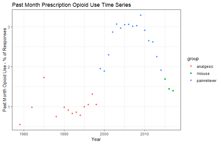
I have it color coded to show the various changes to survey wording, explained above. It's only with hesitation that I share this, because I don't think the points from different years are measuring the same thing. But in the spirit of full transparency, here it is. If I were less honest, I might have only shared the piece that was missing from my previous posts, the 1979 to 1998 period. If I were a demagoguing drug warrior, I might emphasize the 1998 to 2003 transition as a "spike in opioid abuse" without disclosing the differences in surveys. What looks like a "tripling of opioid abuse rates" is really three intermediate data points (1999 to 2001) in between a low plateau and a high plateau. Data is never as clean as we'd like. Even in a modern, developed nation with reasonably good institutions, national vital statistics are garbage. I'm left with the dueling feelings that we should either 1) double the meager resources spent collecting and analyzing national vital statistics or 2) get completely out of the business so that we stop sparking these unnecessary moral panics. My preference is for 2), given the ease with which a spurious trend turns into a set of very bad policy prescriptions. Option 1) could in principle be done right, with an appropriately alert political class and with sufficiently diligent and self-critical journalist and sufficiently aware voters. Unfortunately for option 1), those important qualifiers are missing in the real world.
I am shocked at how hard it was to find any source for this data all compiled in one place, and yet how easy it was to actually get to it and cobble it together. Anyone could have spent about 15 minutes text searching the SAMHSA code books for the "analgesics - past month" (and later "pain relievers - past month") to pick out the relevant figure for each year the survey was done. Those data are problematic for the reasons explained above, but it's baffling that nobody even tried. The closest I ever found was the figure of "lifetime nontheraputing use of prescription drugs" from Lies, Damn Lies, and Drug War Statistics. What I've done in this post is hardly satisfactory. The raw underlying survey data is available online. (See this link, right side. Click the year you want, then click the link under "Datasets in this Study", and you'll see the survey data available in several formats.) There are a lot of columns (~2,000) to parse, the columns are poorly named, and the contents are written in code (like "1 = male, 2 = female" rather than stating the contents in plain English). But it's the kind of thing a grad student with a free summer could easily hack through. I'm surprised that nobody has thrown the resources into such a project. If they have, it's been very difficult to find. Feel free to correct me in the comments if you find a source where someone has done this.
__________________________________
Please allow me to totally geek out for a moment here. If someone wanted to take this data and convert "% of respondents" to "% of the population", it wouldn't be that hard. All you'd have to do is run a few regressions. The surveys contain various demographic variables, like age, gender, race, and martial status. The regression models would use these as variables as predictors and targets "past month use" as the dependent variable. Each year's survey could have its own regression model, which characterizes the "past month use" rates for that year. Then one can simply create a synthetic data set that represents the demographic distribution for each year (say, "0.2% of the population is white, male, unmarried, 16; 0.3% of the population is white, male, unmarried, and 17, ...") and get the regression's predicted drug use rates for each demographic, then weight them together for a total population use rate. Alternatively, if the goal is to remove the effect of changing demographics, you could use one year's distribution of demographics and apply each year's regression model to this data set. I keep saying "regression", but I'd be tempted to use a gbm or some other kind of tree-based model for this project. A process like this would make the survey data comparable across years. It should flatten out the 1979 to 1988 data points, or otherwise reveal a real trend if there is one. Anyway, it would correct for sampling differences between years, some of which seem to be deliberate attempts to capture under-sampled populations of past surveys.
No comments:
Post a Comment